So, I’ve seen my cover for PROOF BY SEDUCTION, and it is lovely. But I’m not sure if I can show it to anyone yet.
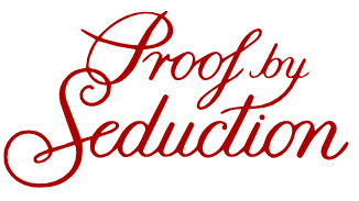
In any event, since I am still waiting for the go-ahead, I thought I would share one of the things I loved about this cover with you: The font they used for the title.
 Isn’t that gorgeous? Okay, the title isn’t in red on the cover of my book; it’s in white (the rest of the cover is a fairly rich purple). But I had to make it red here, just for fun.
I love it! The rest of the cover is even better (including, um, the part that is most interesting to me and least interesting to you, namely, my name). But I’ll have to wait to post it until I get the official go-ahead.
For now, you’ll just have to believe that the rest of the cover is as gorgeous as the title. 🙂

That is a nice font!
That’s really pretty!:)
Yay font!
Your cover sounds super. I love lilac/purple. Hope you get to show us the cover soon.
Gorgeous!!! Love it!
How exciting!!! And I love the font. Can’t wait to see the cover.
I like this font, will be watching for the cover.
How exciting! I can’t wait to see it.
You tease!
Can’t wait to see the cover.
Oooh, I can’t wait, CM!!!